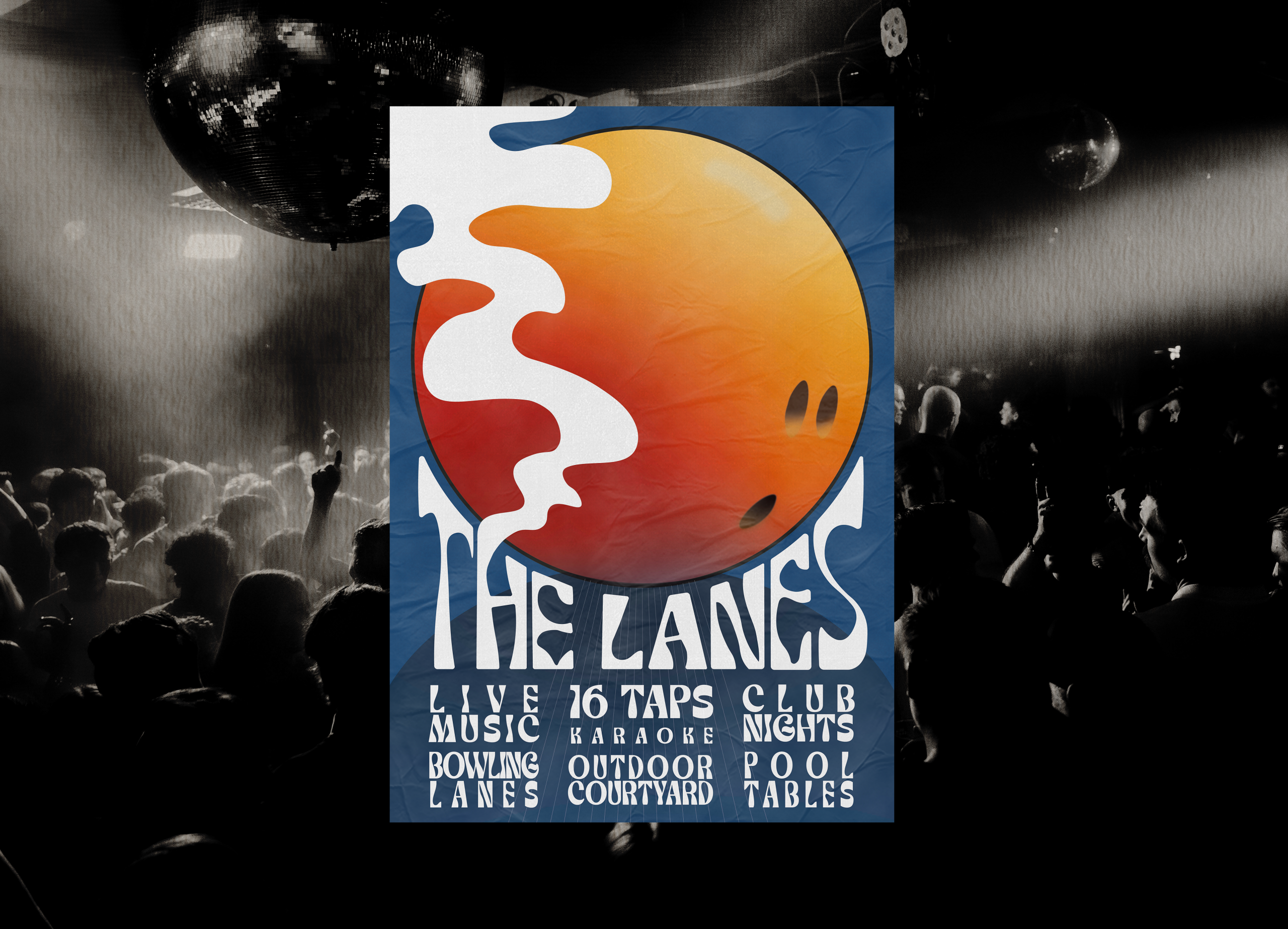
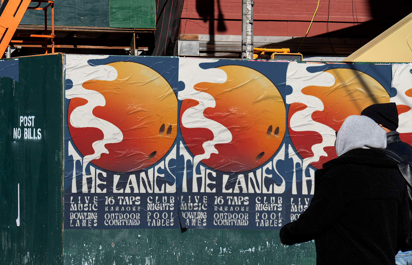
The Lanes is a music venue and bowling alley hosting a variety of features in their large capacity venue. The challenge was to fit the information on, while attaining an eye-catching appropriate visual.
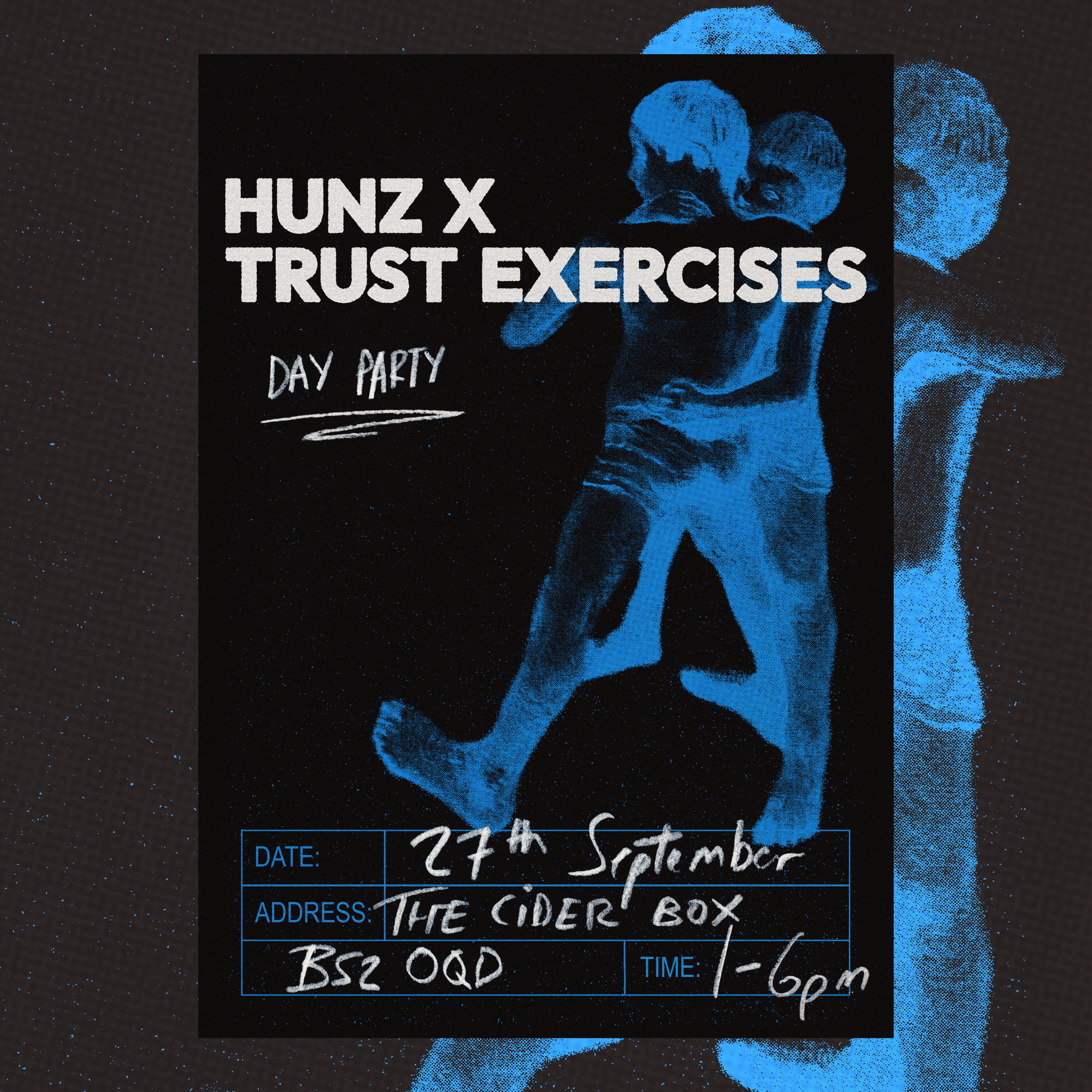
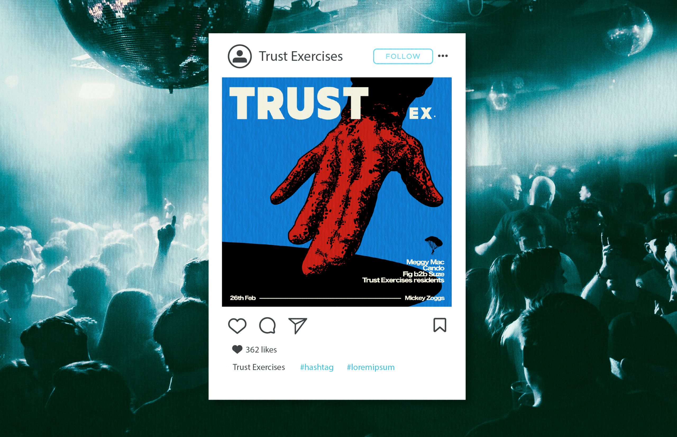
‘Trust Exercises’ is a music collective that holds events in Bristol and London. Blue and red were chosen as the primary colours and have been used throughout their branding.
Brochures
Print
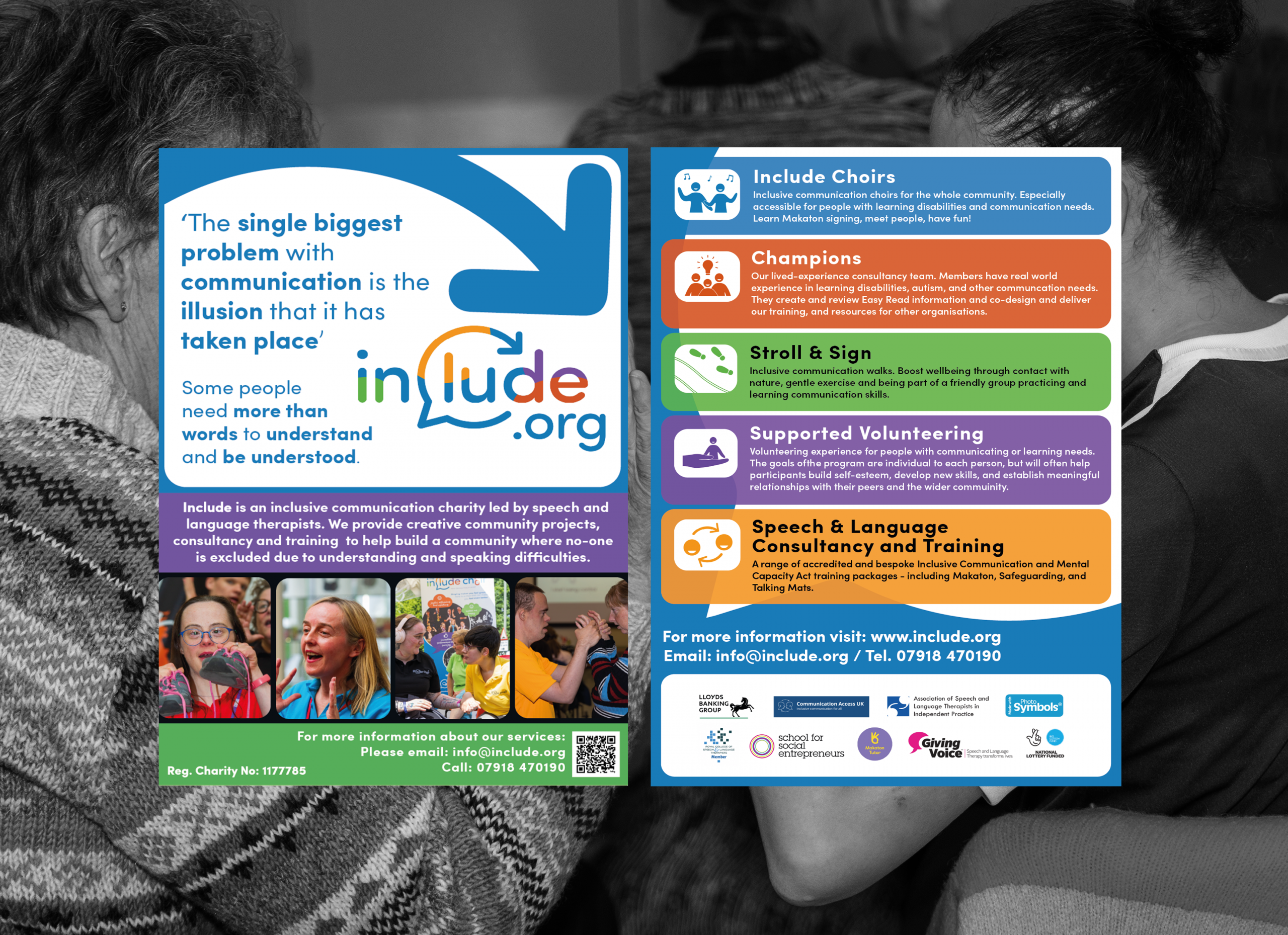
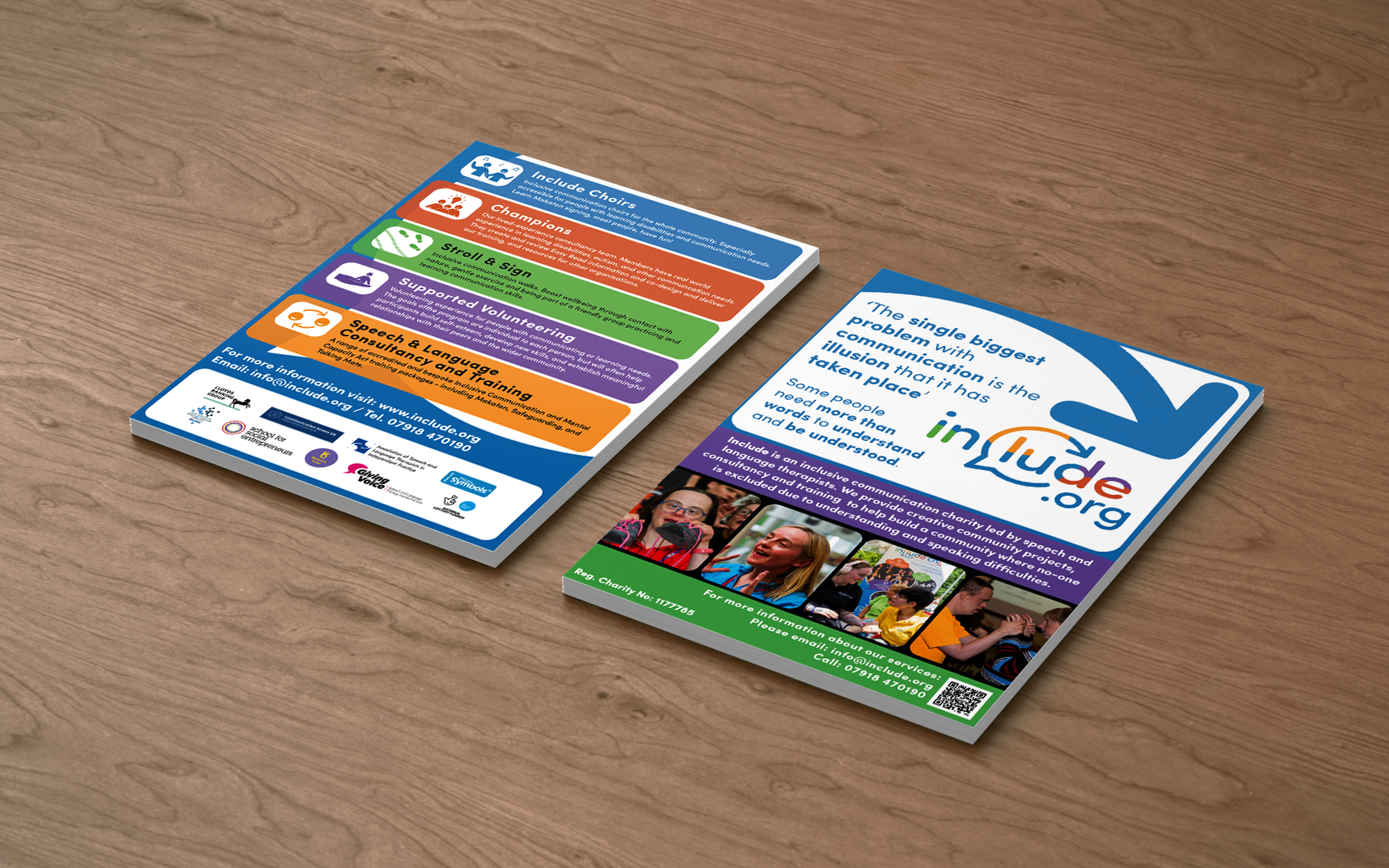
Informational posters for the charity and business sector. Splitting up information into blocks allows a reader to quickly scan for relevant material. Colours are used sparingly and only for the most important elements. Shades of blue reflect the company’s branding.
Include.org is a charity focusing on speech and language accessibility. The brochure had to be clear and readable for those it helped. Elements of previous branding were used to tie it to other assets including the website, such as speech bubbles, arrows, and key colours.
Theatre advertisement
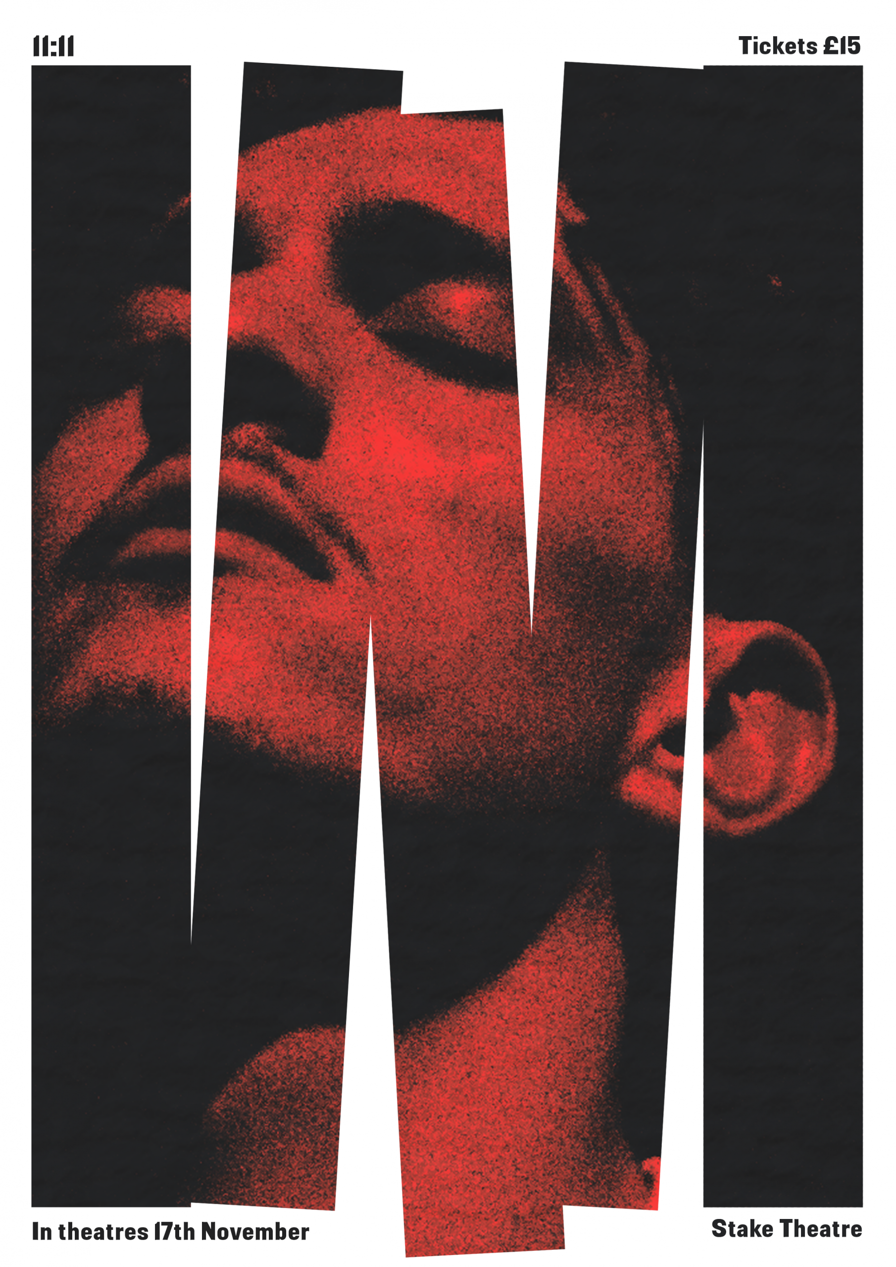
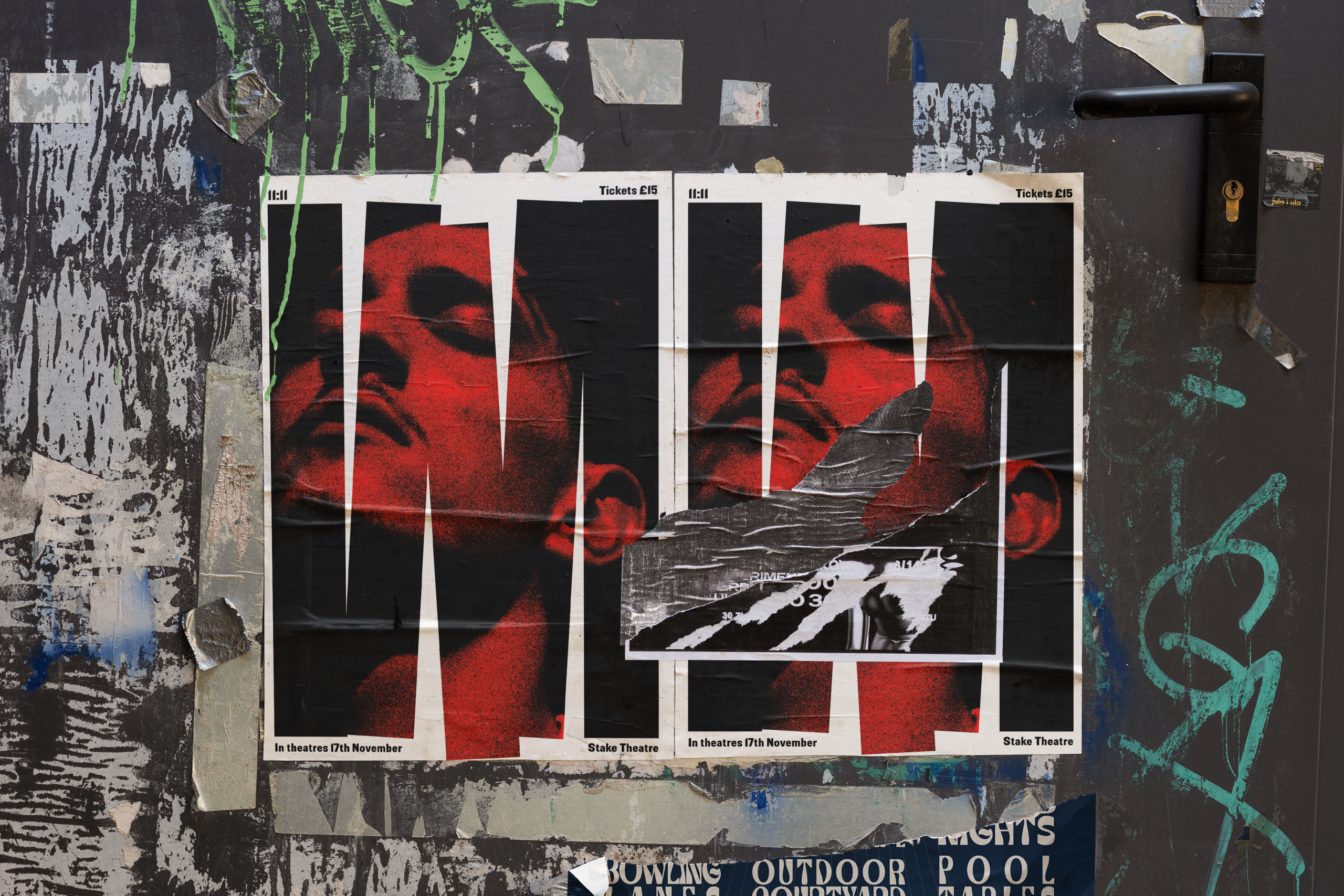
11:11
Surrounding superstition and fate, 11:11 is about a making the right choices and not falling too far in.
The information is spread around the space, with an eye-catching centrepiece, taking inspiration from the likes of Saul Bass, and Viennese exhibition posters.
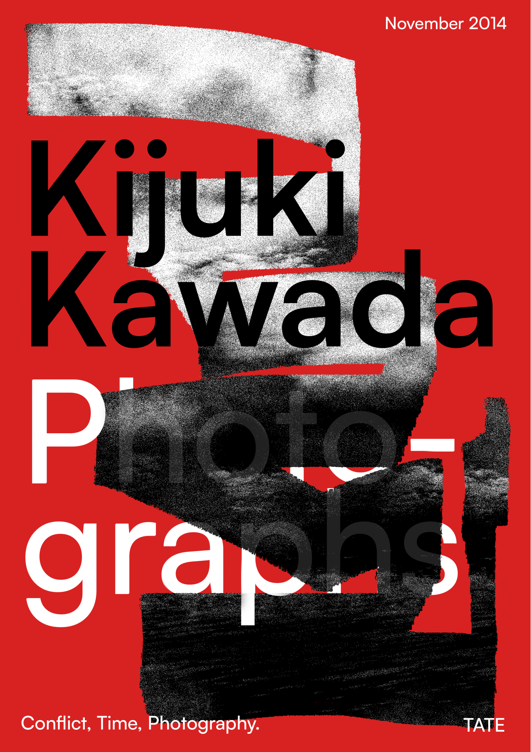
Kijuki Kawada: Photographs
Exhibition Poster
In 2014, I was always visiting whatever free galleries there were.
One that inspired this redesign was: ‘Conflict, Time, Photography’ at the Tate Modern.
It was my first introduction to Photography as a flexible form of artwork that appeared in a gallery setting. Kijuki Kawada was a photographer who captured the aftermath of the Hiroshima bombing, showing the city in ruin, the radiation is almost felt through the grain in the photographs.
The show also coincided with Kawada’s zine ‘The Map’. This combined design and photography in a completely new way to me, and had a great effect on my work going forward.
Motion Design
Exhibition Visuals
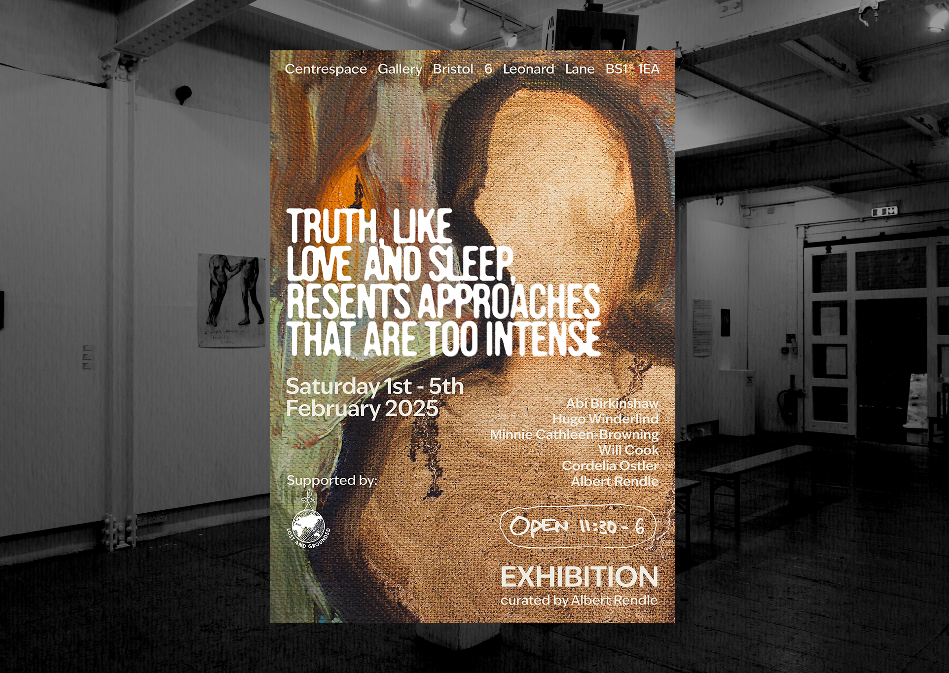
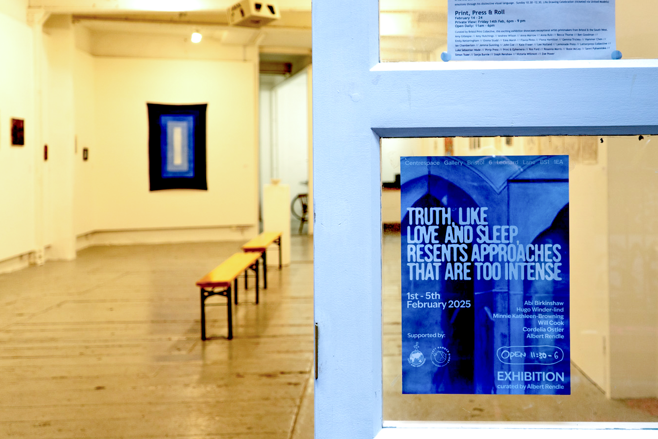
"Truth, Lke Love and Sleep, Resents Approaches That Are Too Intense"
The artwork used at the exhibition here was a primary focus when designing, revealing a sense of the kind of work at the show. The colours had to follow, and the information had to read well. Hand drawn features mirror the context of the brief, and split up text-heavy blocks.
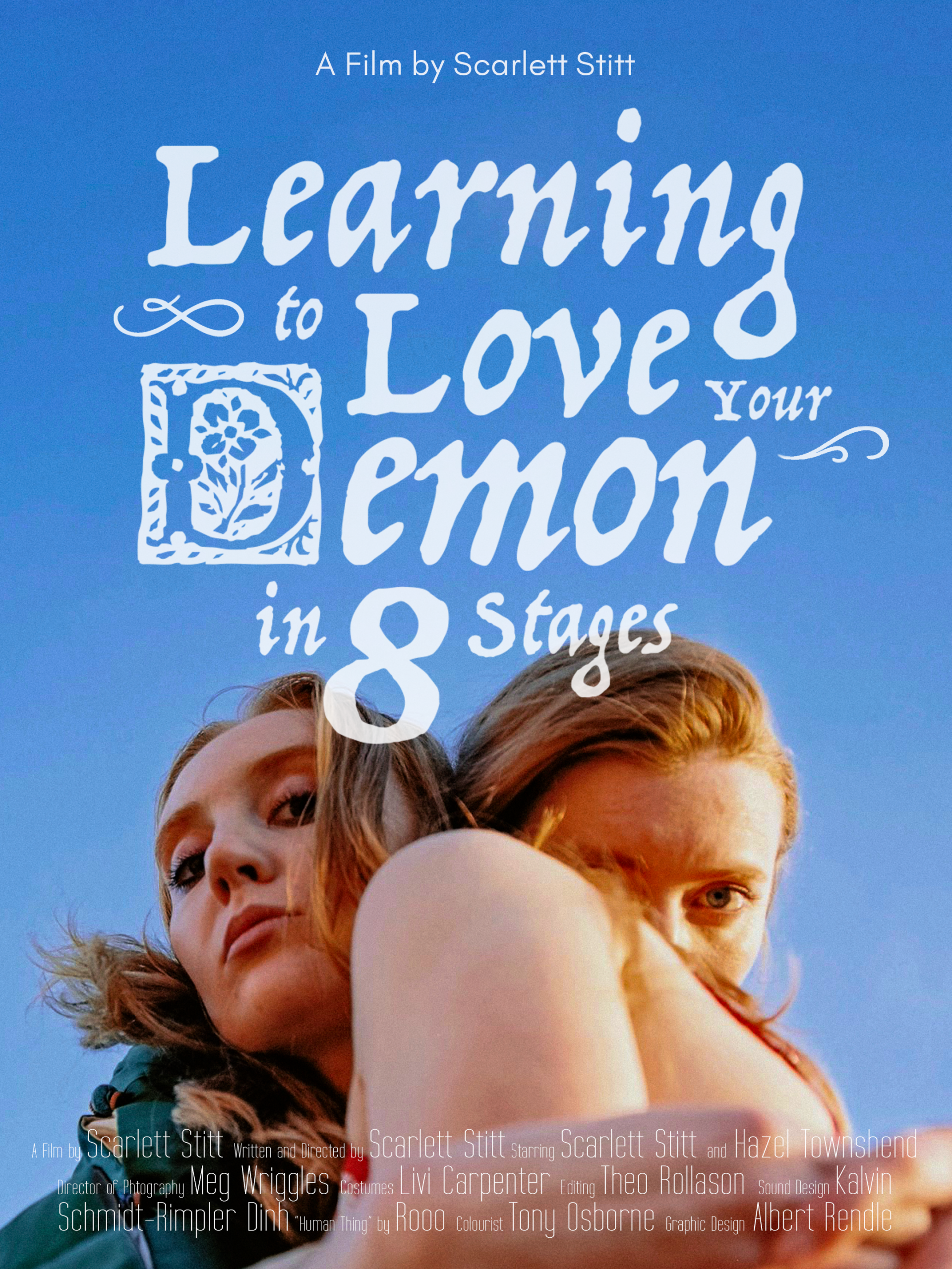
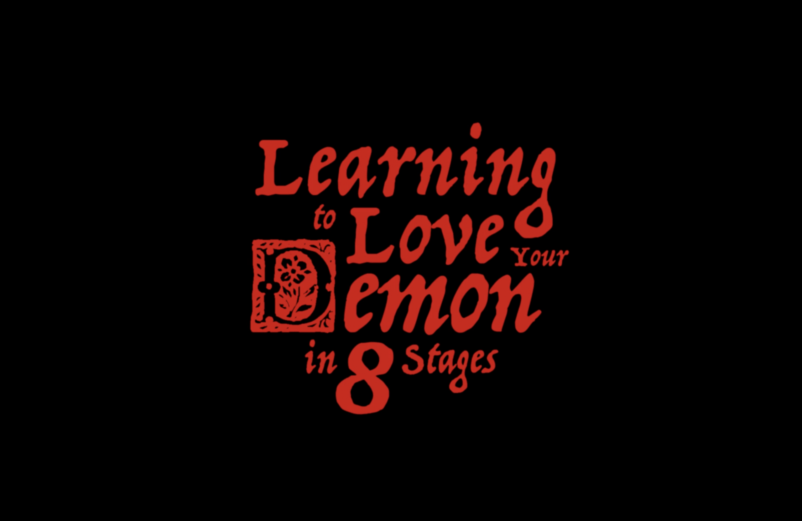
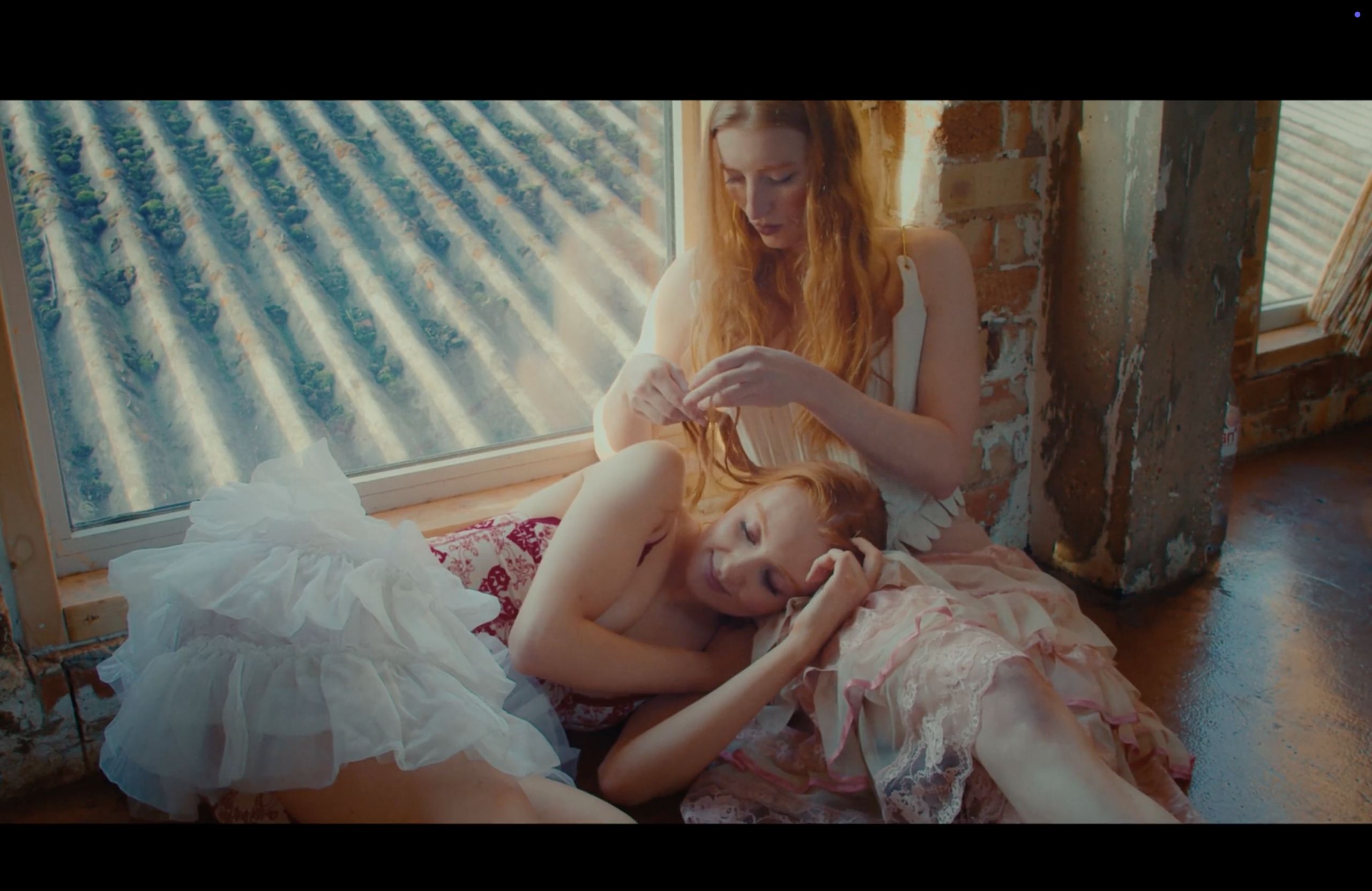
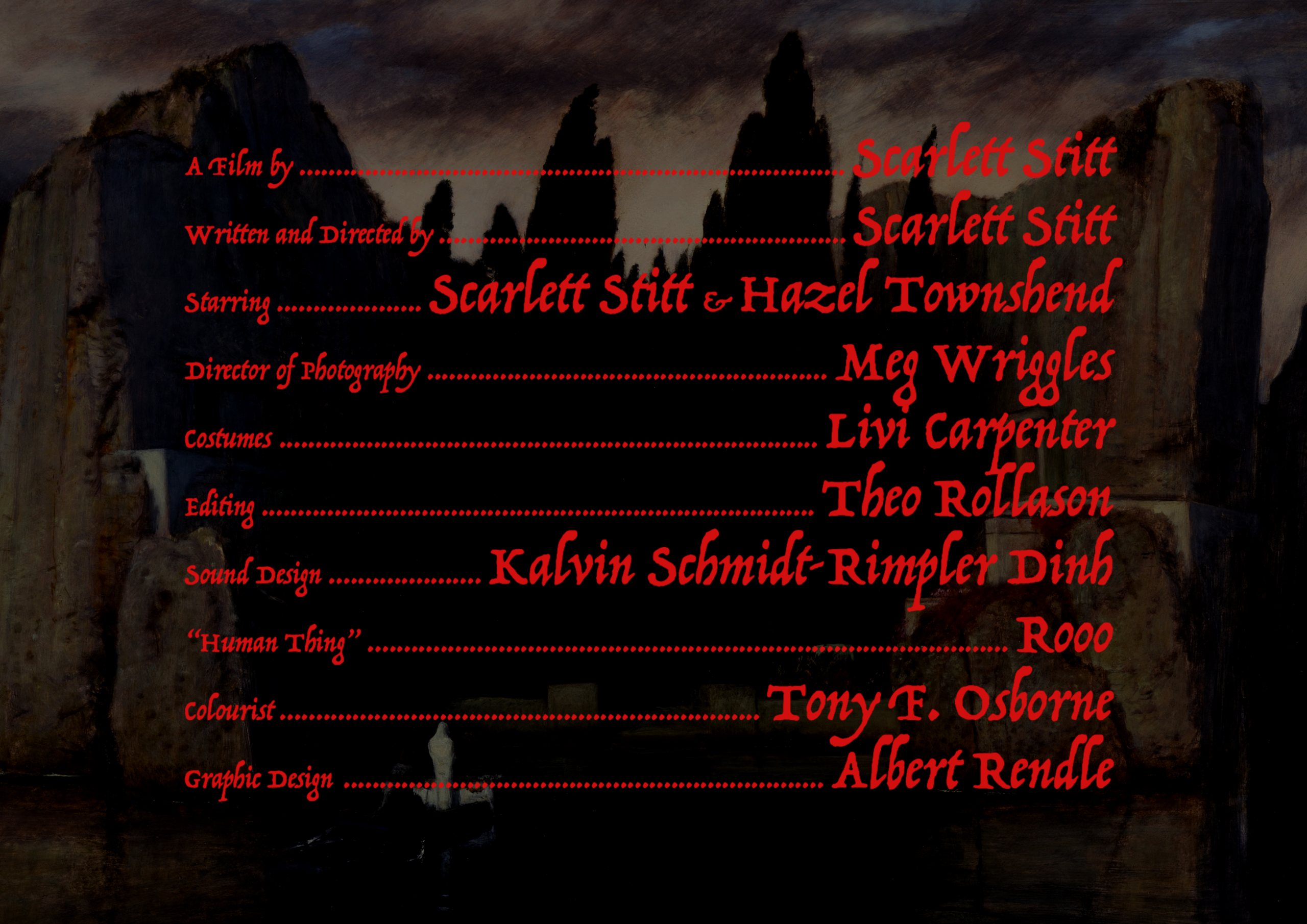
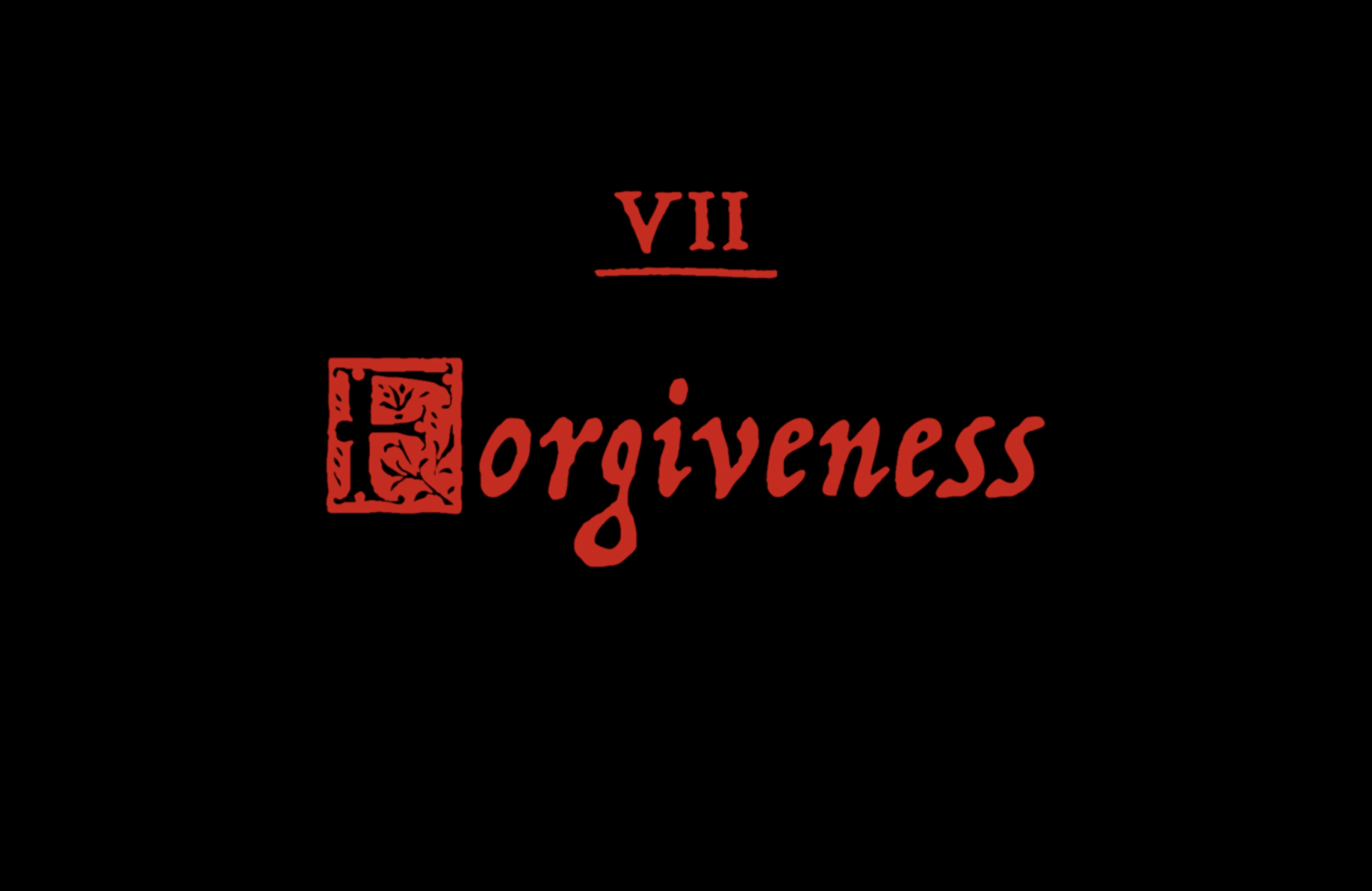
A clowned up version of what would happen if you met your demon. The predominant colour of the film was red, reflected in the costumes and subject matter.
The timeless font allows the setting of the film to be ambiguous, in an alternative limbo between worlds.
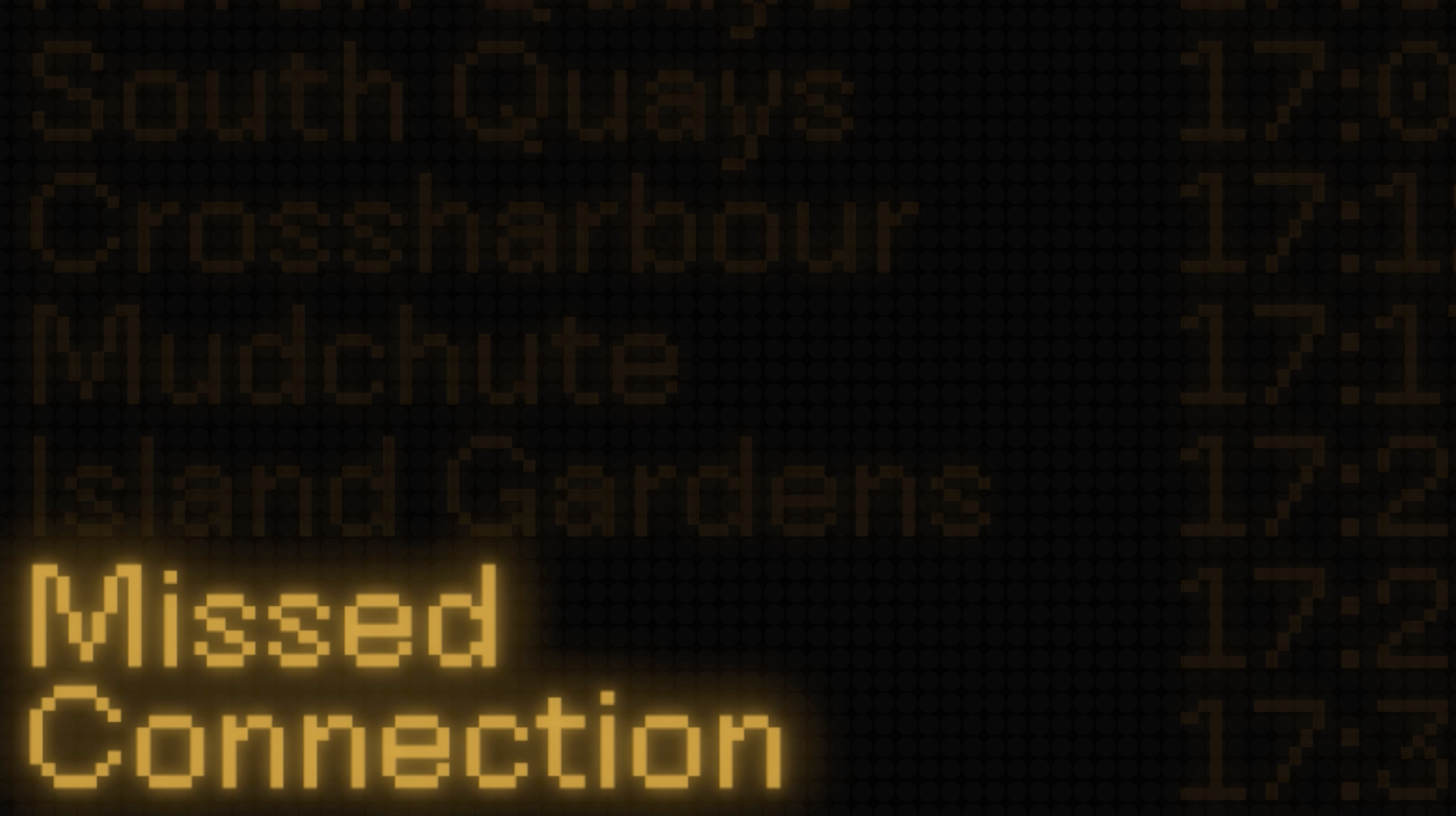
Title sequence
'Missed Connection' 2026
This short film is based on the DLR train in London. It is about two people who get caught up in their own miscommunication while on a commute. The director wanted the film to reflect the LED display boards found in London train stations. I used the stations of the line on which it was filmed on the board, scrolling down to the main title.
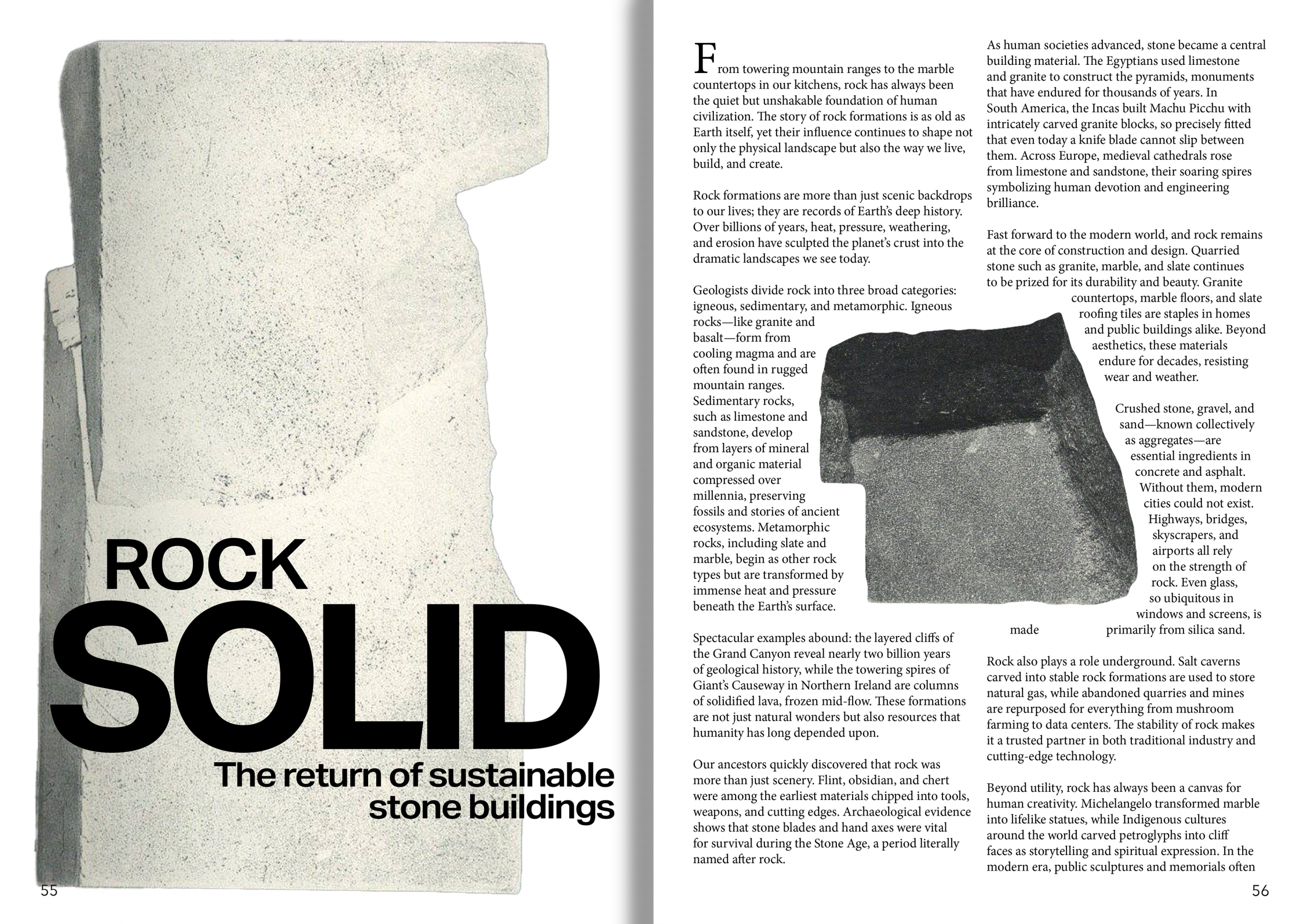
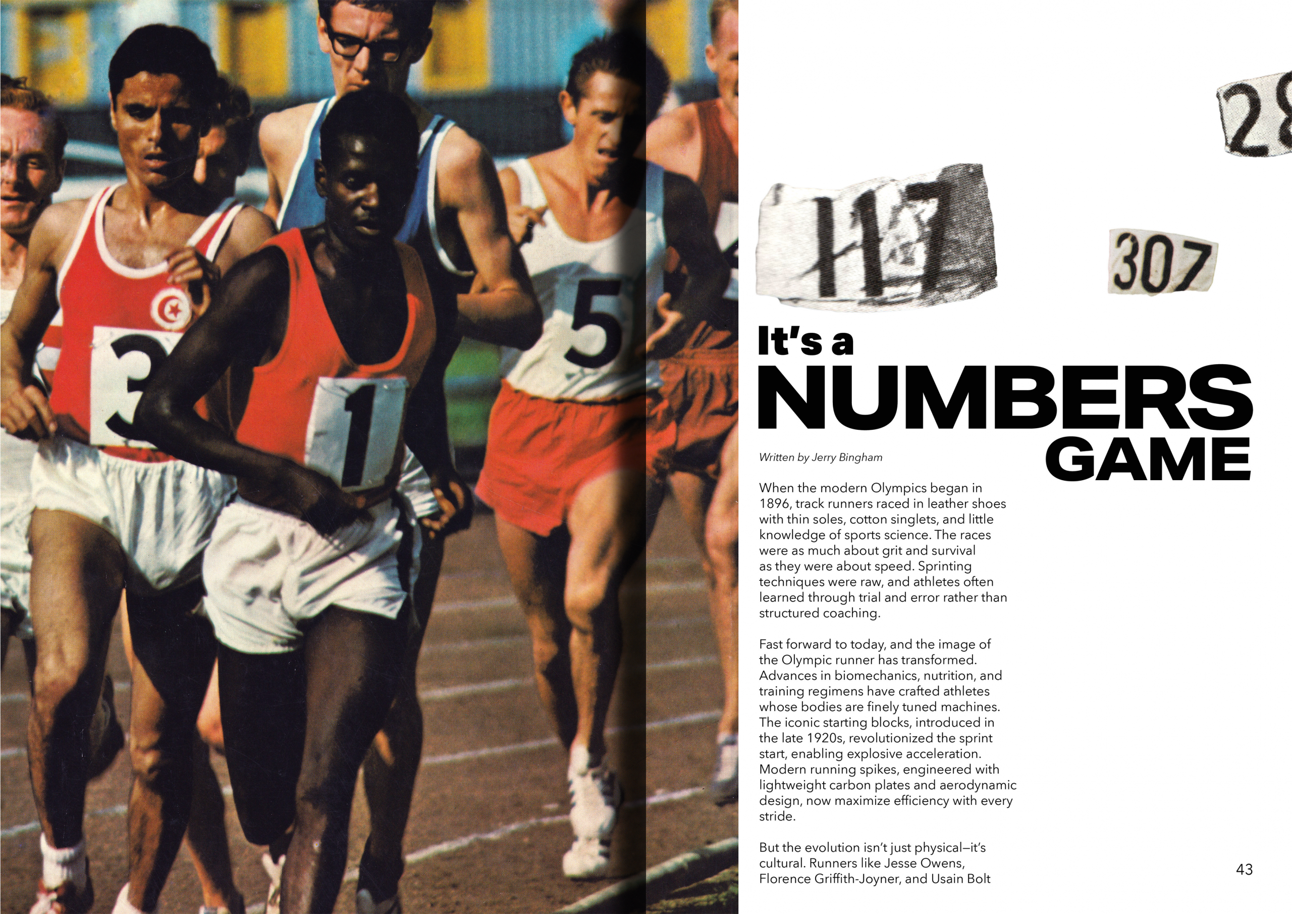
Page Layout
Magazine layout design, 2025
Challenging the use of text and image for publication, these layouts integrate parts of the text with images, allowing the reader to refer to them for greater context.